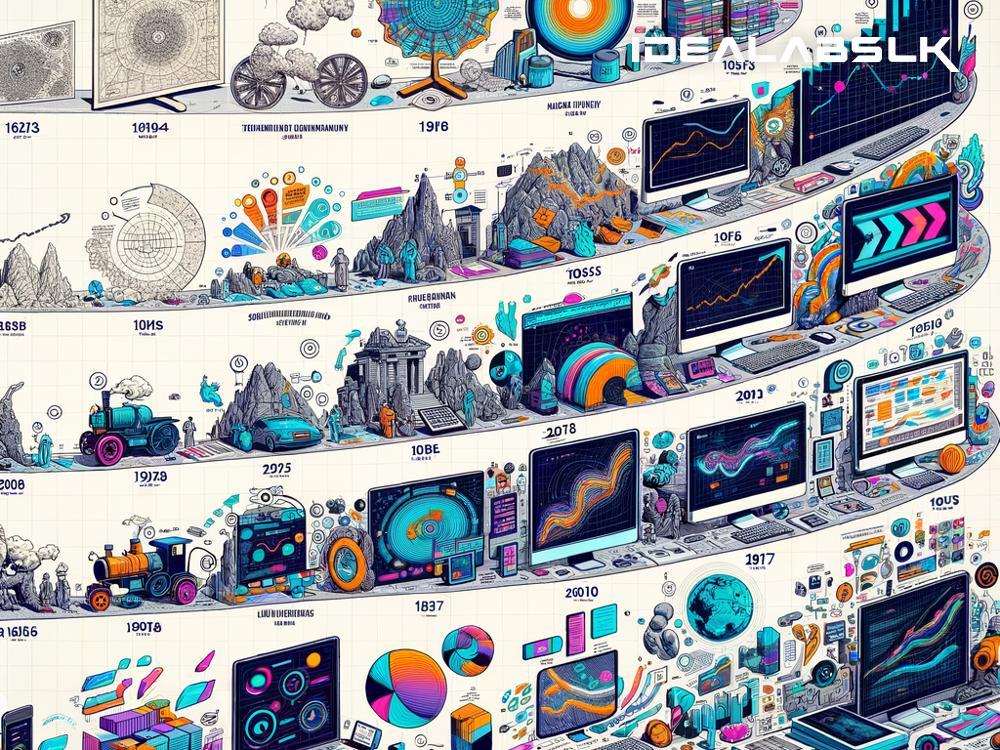
The Evolution of Data Visualization in Graphic Design: A Simple Guide
In the world of graphic design, data visualization has emerged as a superpower, transforming raw data into compelling visual narratives. This journey from text-heavy reports to visually engaging graphics hasn't happened overnight. Let's embark on a simple exploration of how data visualization in graphic design has evolved and why it's more important now than ever.
From Tables to Trends: A Brief History
Once upon a time, data was mostly trapped in tedious tables or dense documents, making it a challenge for most people to decipher. Picture endless rows and columns in Excel spreadsheets – not exactly the stuff of storytelling, right? But as the years rolled by, a significant evolution unfolded in the realm of graphic design. The advent of digital tools and technologies breathed new life into how information was presented.
The Emergence of Infographics
In the early stages, infographics began to gain popularity. Infographics are like visual shortcuts that help our brains capture the essence of data quickly and memorably. Instead of slogging through columns of numbers, you could now see trends and relationships unfold in colorful charts, graphs, and diagrams. This marked a significant move towards making information more accessible and digestible for the everyday person.
Interactive Data Visualization: The Game Changer
The real game-changer came with the introduction of interactive data visualization. Now, not only could you see data in a visual format, but you could also engage with it. Tools and platforms began to offer features where viewers could hover over graphs for more details, zoom in on maps for localized data, or click through a timeline to see changes over periods. This interactivity added a whole new dimension to storytelling, making the exploration of data not just informative but also incredibly fun.
The Role of Big Data and AI
As we marched into the digital age, the explosion of big data and advancements in artificial intelligence (AI) pushed the boundaries of data visualization further. With more data available than ever before, graphic designers faced the challenge of presenting it in ways that make sense to the average person. AI and machine learning algorithms came to the aid, helping to sift through massive datasets to uncover patterns and insights. This not only made data visualization more sophisticated but also more insightful, offering predictions and revealing hidden connections that might not be apparent at first glance.
Today's Trends in Data Visualization
Today, the trends in data visualization blend creativity with functionality. Minimalist designs, dramatic color contrasts, and bold typography are being used to grab attention, while dynamic and interactive elements ensure that viewers stay engaged. The focus is on clarity and user experience, ensuring that data doesn't just look good but is also meaningful and easy to understand.
Why Data Visualization in Graphic Design Matters More Than Ever
In our information-saturated age, attention is a scarce commodity. Data visualization cuts through the noise, offering a clear and immediate understanding of complex information. For businesses, this means better decision-making based on data-driven insights. For the public, it means staying informed about serious issues like climate change or public health with a quick glance at a chart or map.
Moreover, in a world where "fake news" and misinformation are rampant, well-designed data visualizations serve as anchors of credibility and clarity. They offer a way to present data transparently, making it harder for important facts to be misrepresented or misunderstood.
Looking Ahead: The Future of Data Visualization
As we look to the future, it's clear that data visualization will become even more intertwined with our daily lives. Advances in technology will likely introduce new forms of visualization, perhaps integrating augmented reality (AR) or virtual reality (VR) to create immersive data experiences. The potential for more personalized data visualizations, which adapt to the individual's interests or understanding level, could also transform how we consume information.
In conclusion, the evolution of data visualization in graphic design is a testament to our continual quest for understanding. From simple charts to interactive maps that tell stories, the journey of data visualization is far from over. As we move forward, the fusion of design, technology, and data promises not only to inform but also to inspire. In a world overwhelmed by data, the ability to visualize information creatively and effectively is more than just artistry; it's a necessity.

