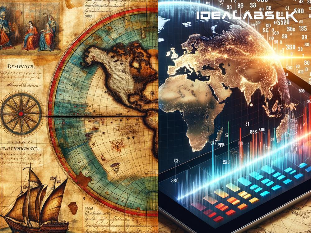
Title: The Fascinating Journey of Data Visualization: From Past to Present
Data visualization might sound like a complex term, but it's something you see and use more often than you might think. Whether it's a weather forecast map, a pie chart in a business presentation, or the health tracking chart on your smartphone, these are all forms of data visualization. But have you ever wondered how we got here? The journey of data visualization is not just a story of the digital age but a fascinating history that spans centuries.
The Early Days
The history of data visualization can be traced back to maps and geographical charts created thousands of years ago. Ancient civilizations used simple visualizations to depict the world around them, mapping out territories, stars, and trade routes. For example, the Turin Papyrus Map, created around 1160 BCE in Egypt, is one of the earliest known maps that represented a geographical area visually.
Fast forward to the 17th century, and we see the emergence of more sophisticated methods of data visualization. One remarkable example is the work of René Descartes, who introduced the Cartesian coordinate system, laying the groundwork for plotting two-dimensional graphs. This innovation was pivotal, as it allowed for the visualization of mathematical functions and data sets in a way that was previously impossible.
The 18th and 19th Centuries: The Birth of Statistical Graphics
The 18th and 19th centuries were a period of significant innovation in the field of data visualization, thanks to the emergence of statistics as a discipline. One of the pioneers of this era was William Playfair, a Scottish engineer and political economist, who created the first line graph, bar chart, and pie chart in the late 18th century. These types of charts provided a new way to represent data and have since become staples in the world of data visualization.
Another noteworthy contribution came from Florence Nightingale, the British nurse and social reformer known for her role in modernizing nursing. Nightingale used a variation of the pie chart called the polar area diagram to illustrate the causes of mortality in the British army during the Crimean War. Her compelling visualizations helped persuade government officials to improve army health standards, showcasing the power of data visualization in effecting social change.
The 20th Century: The Rise of the Digital Era
The invention of computers in the 20th century revolutionized data visualization. The processing power of computers allowed for the handling of large data sets and the creation of more complex and interactive visualizations. One of the first instances of computer-generated visualization was a wireframe model of a car created in the 1960s by General Motors. This innovation marked the beginning of computer-aided design (CAD), which has since transformed fields ranging from architecture to animation.
The latter part of the 20th century saw the development of the internet, which further democratized data visualization. Tools and software became more widely available, enabling not only scientists and statisticians but also journalists, business analysts, and the general public to create and share visualizations. The rise of platforms like Tableau, Microsoft Excel, and Google Charts in the late 20th and early 21st centuries has made data visualization more accessible and integral to our daily lives than ever before.
The 21st Century: The Age of Big Data and Interactivity
Today, we live in the age of big data, where vast amounts of information are generated every second. Data visualization has become an essential tool for making sense of this torrent of data. Modern visualizations are not just static charts and graphs; they are often interactive, allowing users to explore data in real-time and gain insights that would be difficult to extract from raw data alone.
Augmented reality (AR) and virtual reality (VR) are pushing the boundaries of data visualization further, offering immersive experiences where users can interact with data in three-dimensional space. The potential applications for this technology are vast, from enhancing educational tools to transforming the way businesses analyze market trends.
Wrapping Up
The history of data visualization is a testament to human creativity and our quest to understand and communicate complex information. From ancient maps to immersive VR data experiences, the evolution of visualization reflects broader technological and cultural shifts. As we continue to generate and rely on vast quantities of data, the role of data visualization in our society is only set to grow, making it an exciting field to watch in the coming years.

