The Origins of Infographics and Data Visualization
In today's whirlwind of digital information, it's hard to imagine a world without visuals to break down complex data. From colorful charts in a classroom to interactive maps on your smartphone, infographics and data visualization have become fundamental tools in understanding and communicating data. But have you ever wondered where it all began? How did humans start the journey from ancient cave drawings to the sophisticated, data-driven graphics we rely on today? Let’s embark on a time-travel adventure to explore the origins of infographics and data visualization.
From Prehistoric Times: The Dawn of Representation
Before the written word, our ancestors used visuals to represent their world. Ancient cave paintings, dating back over 30,000 years, are arguably the earliest forms of infographics. These were not mere expressions of artistic creativity but a way to communicate information about hunting seasons, animal migrations, or tribal narratives. Fast forward to ancient Egypt, where hieroglyphics—symbolic pictures representing words and sounds—were used to document important events and relay complex information, embodying the essence of visual data communication.
The Middle Ages: Maps and Manuscripts
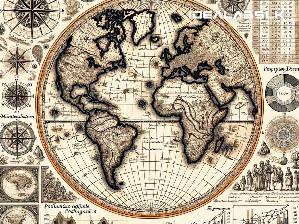
During the Middle Ages, scholars and monks began to incorporate visual elements into their manuscripts, creating intricate illustrations to accompany texts, making information more accessible and understandable. Maps from this era, like the Mappa Mundi, were more than navigational tools; they were rich with data about different cultures, geography, and even mythological elements, serving as early attempts at summarizing a vast amount of information into a single, comprehensible visual.
The 17th to 19th Century: The Rise of Statistical Graphics
The real transformation in data visualization came with the Enlightenment, a period that emphasized reason and scientific inquiry. In the 17th century, breakthroughs in mathematics and statistics paved the way for more sophisticated forms of data representation. One notable figure was William Playfair, a Scottish engineer and political economist, who in the late 18th century invented some of the most common types of charts we use today: the line graph, bar chart, and pie chart. These innovations marked a significant shift towards more abstract and quantitative forms of data visualization.
The 19th Century: The Golden Age of Data Visualization
The 19th century witnessed a golden age of data visualization, where information graphics became increasingly used in public and academic spheres. One of the era's most iconic examples is Charles Minard's 1869 map showing Napoleon’s 1812 Russia campaign. Without any modern technology, Minard masterfully integrated six types of data (like the army's size, location, direction, temperature) into a single two-dimensional image. It stood as a powerful testament to the potential of visual storytelling to make complex data easily understandable.
The 20th Century: The Advent of Computers and the Digital Age
The development of computers in the 20th century revolutionized data visualization. Software programs could now handle large datasets, create dynamic visuals, and enable interactive graphics, making data visualization more accessible and widespread. The latter half of the century saw the emergence of digital platforms and the internet, which further democratized data visualization, allowing anyone with a computer to create and share infographics.
Today and Beyond: The Future of Infographics and Data Visualization
Today, infographics and data visualization are indispensable in journalism, education, business, and various other fields. Tools like Tableau, Adobe Illustrator, and online platforms have made it easier than ever to craft compelling visual stories from data. As we look to the future, advancements in technology, such as augmented reality (AR) and virtual reality (VR), hint at even more immersive and interactive ways to visualize information.
Visual representation of data has come a long way from cave paintings and hieroglyphics to the sophisticated, interactive graphics we have today. Each step in this journey has been driven by the constant human urge to communicate better and understand the world around us. As technology advances, so too will our methods of data visualization, continuing to transform complex information into visual stories that are as compelling as they are enlightening. In this age of information overload, the ability to distill vast amounts of data into clear, engaging visuals is not just useful—it’s essential. The journey of infographics and data visualization, rooted in the distant past, continues to shape how we comprehend and interact with the world, promising ever more innovative ways to illuminate our understanding tomorrow.

